Work > College Project > Harmon Solar
Work > College Project > Harmon Solar
Work > College Project > Harmon Solar
Introduction
Introduction
Introduction
Evaluating the usability of the Harmon Solar website using Nielsen Design Group’s Ten Usability Heuristics. The goal was to identify and address key usability issues, ensuring a more user-friendly experience for potential solar energy customers.
Evaluating the usability of the Harmon Solar website using Nielsen Design Group’s Ten Usability Heuristics. The goal was to identify and address key usability issues, ensuring a more user-friendly experience for potential solar energy customers.
Evaluating the usability of the Harmon Solar website using Nielsen Design Group’s Ten Usability Heuristics. The goal was to identify and address key usability issues, ensuring a more user-friendly experience for potential solar energy customers.
Role
Role
Role
User Researcher
User Researcher
User Researcher
UI Design
UI Design
UI Design
Prototyping
Prototyping
Prototyping
Duration
Duration
Duration
4 Months
4 Months
4 Months
Tools
Tools
Tools
Figma
Figma
Figma
Google Docs & Sheets
Google Docs & Sheets
Google Docs & Sheets
Overview
Overview
Overview
Harmon solar main goal is to Identify and resolve critical usability issues on the Harmon Solar website.
Harmon solar main goal is to Identify and resolve critical usability issues on the Harmon Solar website.

Background
Background
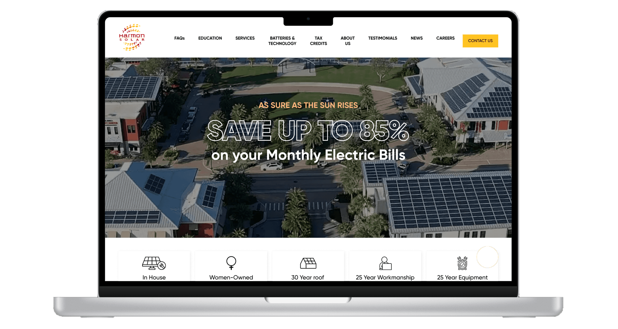
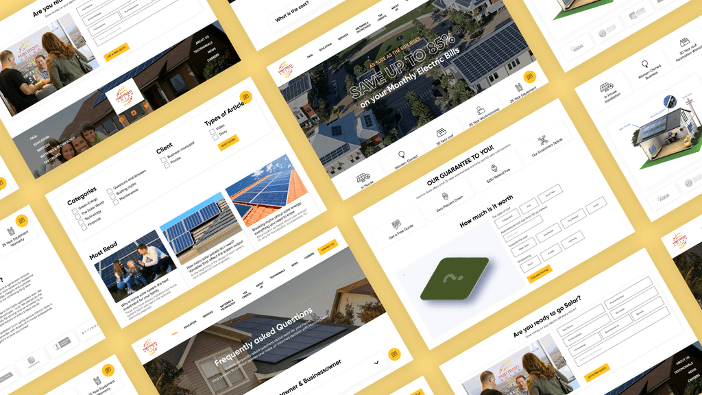
Harmon Solar provides solar solutions for homeowners, businesses, and renters. I conducted a thorough usability evaluation to enhance their online user experience.
Harmon Solar provides solar solutions for homeowners, businesses, and renters. I conducted a thorough usability evaluation to enhance their online user experience.
Objective
Objective
Enhance user experience by refining navigation, ensuring accessibility, and guiding informed solar energy decisions.
Enhance user experience by refining navigation, ensuring accessibility, and guiding informed solar energy decisions.

The Problem
The Problem
Users exploring the Harmon Solar website often experience difficulties with navigation, information clarity, and accessibility.
They struggled to quickly find the solar solutions relevant to their needs whether as homeowners, business owners, or renters and to confidently request quotes or consultations without confusion or frustration.
The Challenge
The Challenge
Aimed to create an intuitive, inclusive, and informative experience by streamlining navigation for easy access to relevant solar services, clearly presenting cost-saving details, and ensuring WCAG 2.1 compliance for universal accessibility.
Aimed to create an intuitive, inclusive, and informative experience by streamlining navigation for easy access to relevant solar services, clearly presenting cost-saving details, and ensuring WCAG 2.1 compliance for universal accessibility.
Harmon solar main goal is to Identify and resolve critical usability issues on the Harmon Solar website.
Background
Harmon Solar provides solar solutions for homeowners, businesses, and renters. I conducted a thorough usability evaluation to enhance their online user experience.
Objective
Enhance user experience by refining navigation, ensuring accessibility, and guiding informed solar energy decisions.
The Problem
Users exploring the Harmon Solar website often experience difficulties with navigation, information clarity, and accessibility.
They struggled to quickly find the solar solutions relevant to their needs whether as homeowners, business owners, or renters and to confidently request quotes or consultations without confusion or frustration.
The Challenge
Aimed to create an intuitive, inclusive, and informative experience by streamlining navigation for easy access to relevant solar services, clearly presenting cost-saving details, and ensuring WCAG 2.1 compliance for universal accessibility.
Design Timeline
Design Timeline
Design Timeline
Research (2 months)
Heuristic Evaluation
Heuristic Evaluation
User Survey
User Survey
Usability Testing
Usability Testing
Usability Issues
Usability Issues
Design (1 months)
Design (1 months)
Design (1 months)
Wireframes
Wireframes
Visual Design
Visual Design
Launch (1 months)
Launch (1 months)
Launch (1 months)
High Fidelity
High Fidelity

PROBLEM
PROBLEM
Is It User-Friendly?
Is It User-Friendly?
Is It User-Friendly?
12 Total Issues
12 Total Issues
12 Total Issues
Key improvements include clarifying the website's purpose, enhancing navigation, streamlining content, and improving chatbot privacy to boost usability and user trust.
Key improvements include clarifying the website's purpose, enhancing navigation, streamlining content, and improving chatbot privacy to boost usability and user trust.
3 Critical Issues
3 Critical Issues
3 Critical Issues
Lack of clarity on each section’s purpose.
Lack of clarity on each section’s purpose.
Lack of clarity on each section’s purpose.
Overall site objectives causes confusion.
Overall site objectives causes confusion.
Overall site objectives causes confusion.
Chatbot requires name/phone number, raising privacy concerns.
Chatbot requires name/phone number, raising privacy concerns.
Chatbot requires name/phone number, raising privacy concerns.
4 Moderate Issues
4 Moderate Issues
4 Moderate Issues
No instant confirmation (e.g., email/phone) after form submission.
No instant confirmation (e.g., email/phone) after form submission.
No instant confirmation (e.g., email/phone) after form submission.
Lack of a back button from blog posts.
Lack of a back button from blog posts.
Lack of a back button from blog posts.
Guarantees section CTAs all lead to the same page, potentially frustrating users.
Guarantees section CTAs all lead to the same page, potentially frustrating users.
Guarantees section CTAs all lead to the same page, potentially frustrating users.
Podcast ad after the banner is unnecessary.
Podcast ad after the banner is unnecessary.
Podcast ad after the banner is unnecessary.
5 Minor Issues
5 Minor Issues
5 Minor Issues
Some pages load slowly with no indication of progress.
Some pages load slowly with no indication of progress.
Some pages load slowly with no indication of progress.
Misaligned headings.
Misaligned headings.
Misaligned headings.
Inconsistent placement of key information.
Inconsistent placement of key information.
Inconsistent placement of key information.
Excessive animation effects may frustrate users.
Excessive animation effects may frustrate users.
Excessive animation effects may frustrate users.
Error messages blend in, risking user oversight.
Error messages blend in, risking user oversight.
Error messages blend in, risking user oversight.
Feedback from Real Users
Feedback from Real Users
Feedback from Real Users
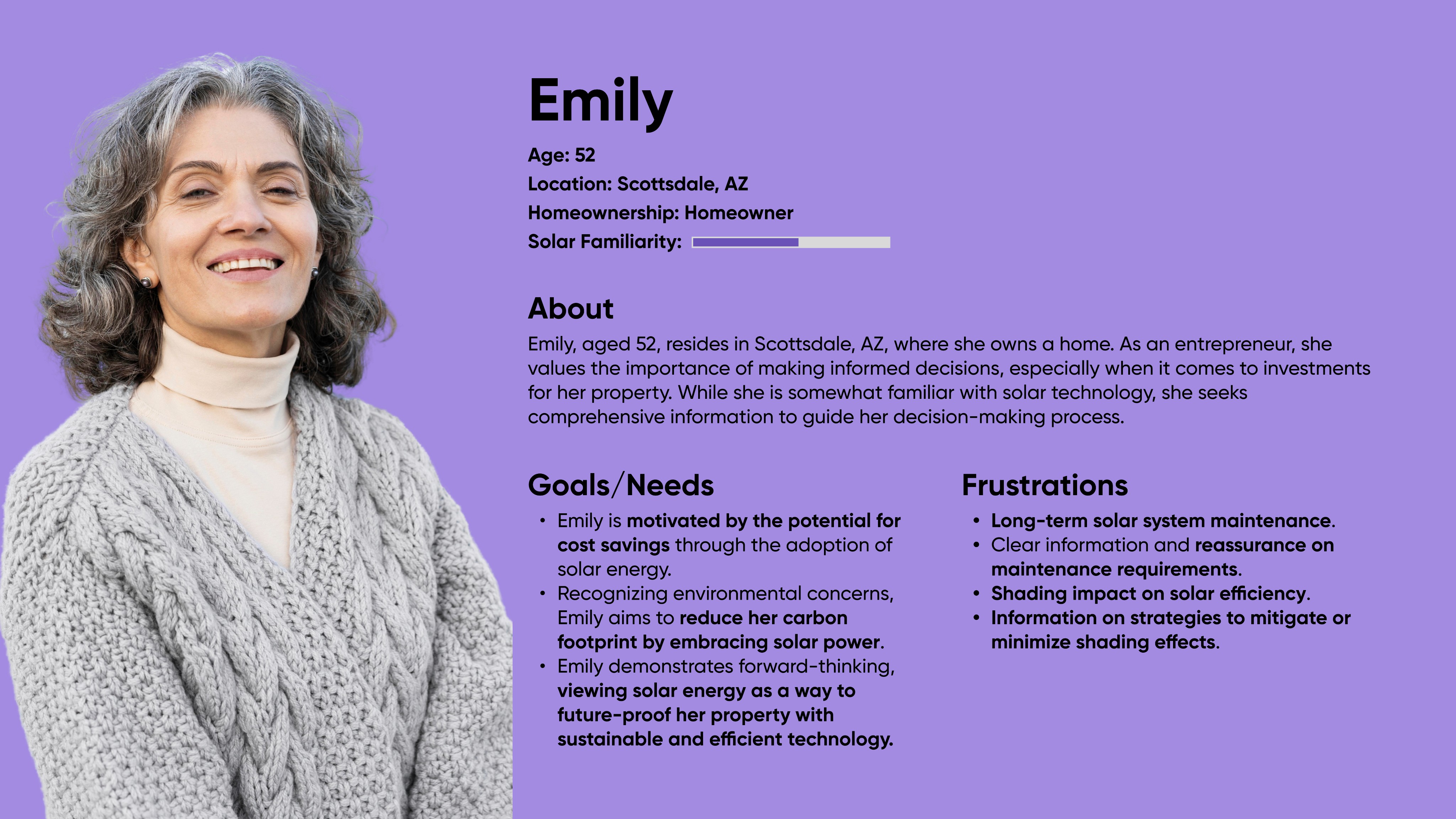
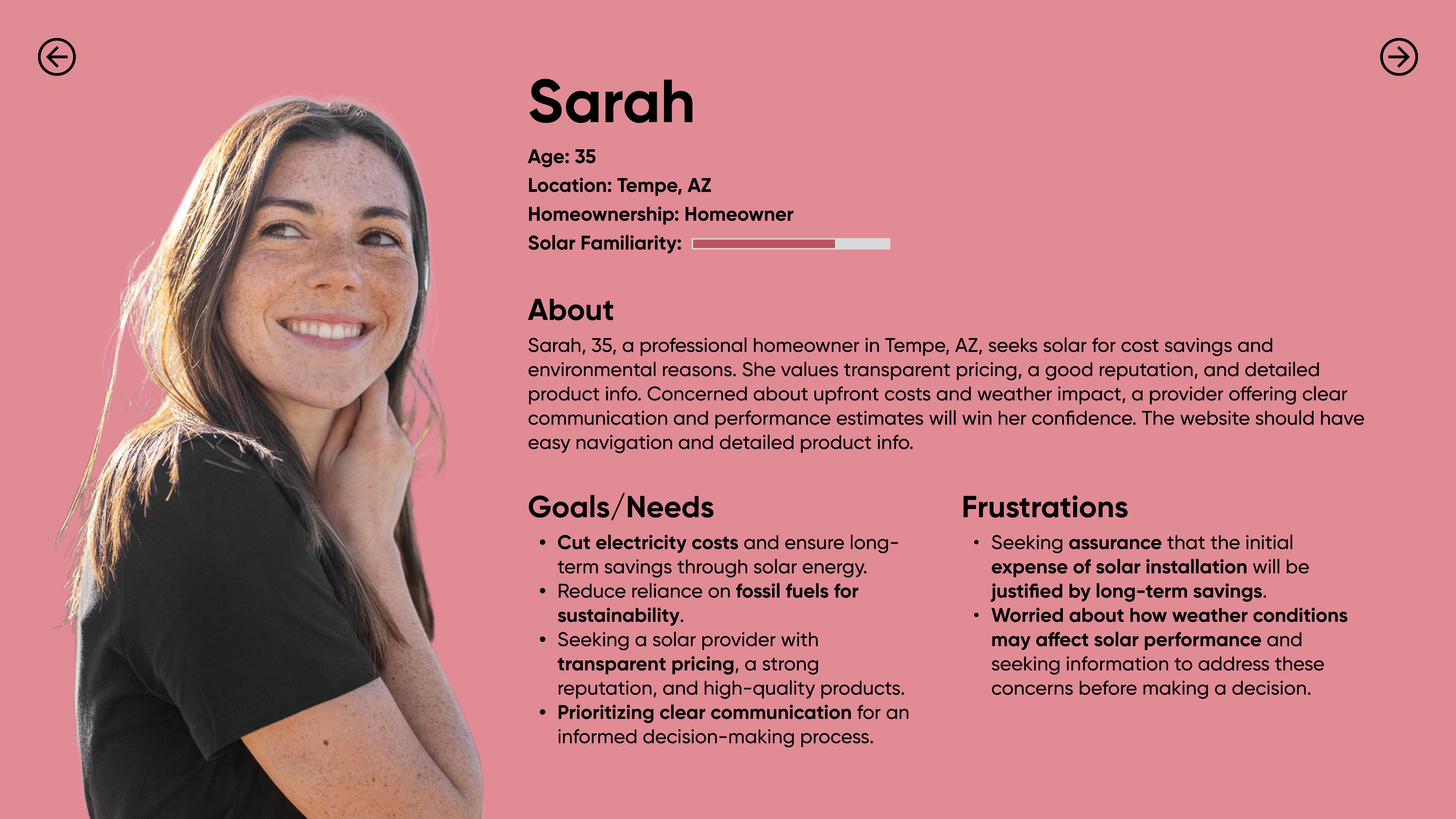
Survey forms were sent out to 8 Harmon Solar users. The user research survey was done to find the following:
Survey forms were sent out to 8 Harmon Solar users. The user research survey was done to find the following:
Interview Question Criteria
Interview Question Criteria
Interview Question Criteria
User's Knowledge and Background
User's Knowledge and Background
User's Experience and Expectations
User's Experience and Expectations
User's Needs and Concerns
User's Needs and Concerns
Does the Design Works for Users?
Does the Design Works for Users?
Does the Design Works for Users?
Addressing issues with navigation and information clarity by recruiting diverse participants and gathering data through observations and feedback.
I developed three specific scenarios to simulate 9 real user interactions and assess the site's effectiveness:
Addressing issues with navigation and information clarity by recruiting diverse participants and gathering data through observations and feedback.
I developed three specific scenarios to simulate 9 real user interactions and assess the site's effectiveness:
Scenario 1
Scenario 1
Scenario 1
Participants were asked to act as homeowners interested in solar power to evaluate savings and environmental benefits. This tested the website's ability to provide relevant information and cost-saving calculations effectively.
Participants were asked to act as homeowners interested in solar power to evaluate savings and environmental benefits. This tested the website's ability to provide relevant information and cost-saving calculations effectively.
Participants were asked to act as homeowners interested in solar power to evaluate savings and environmental benefits. This tested the website's ability to provide relevant information and cost-saving calculations effectively.
Scenario 2
Scenario 2
Scenario 2
Participants assumed the role of business owners considering solar panels to reduce operating costs. This scenario focused on assessing the website's presentation of commercial solar benefits and installation processes.
Participants assumed the role of business owners considering solar panels to reduce operating costs. This scenario focused on assessing the website's presentation of commercial solar benefits and installation processes.
Participants assumed the role of business owners considering solar panels to reduce operating costs. This scenario focused on assessing the website's presentation of commercial solar benefits and installation processes.
Scenario 3
Scenario 3
Scenario 3
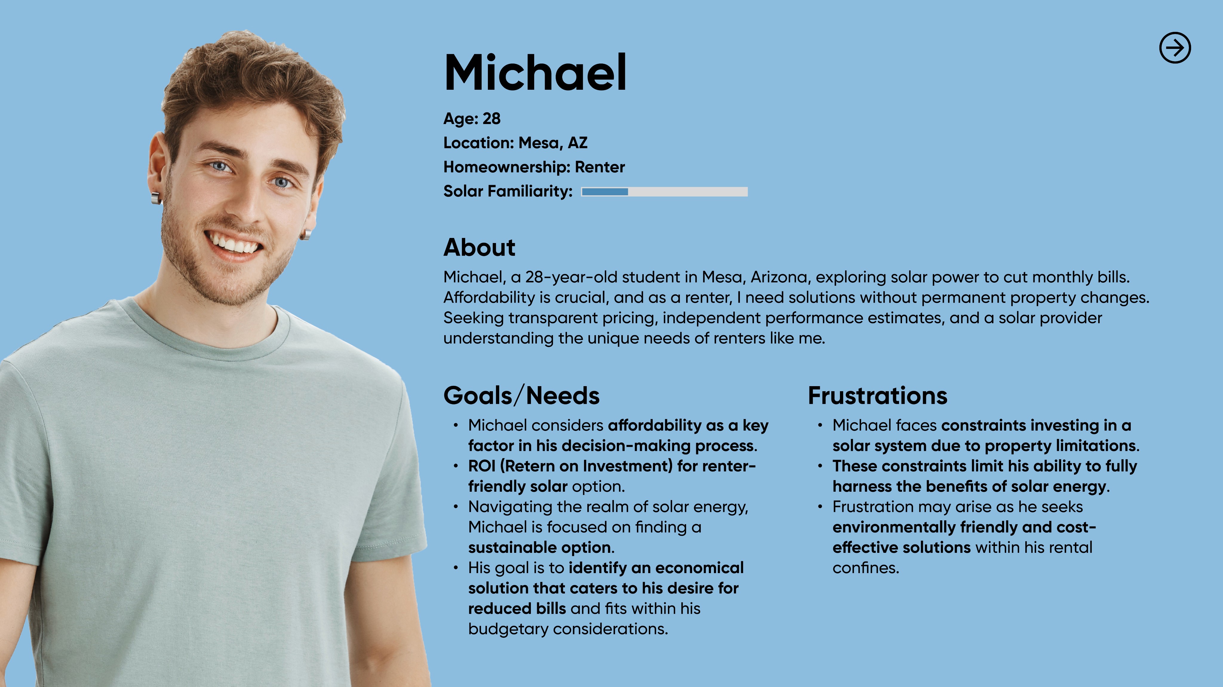
Participants acted as rental customers with questions about solar systems. This tested the website's FAQ and customer support features to determine how well it addresses and resolves user queries.
Participants acted as rental customers with questions about solar systems. This tested the website's FAQ and customer support features to determine how well it addresses and resolves user queries.
Participants acted as rental customers with questions about solar systems. This tested the website's FAQ and customer support features to determine how well it addresses and resolves user queries.
What Users Struggled With and Why
What Users Struggled With and Why
What Users Struggled With and Why
9
9
9
Participants
Participants
15
15
15
Task Tested
Task Tested
9
9
9
Usability Issues
Usability Issues
4
4
4
Area Tested
Area Tested
3 Major Issues Identified
3 Major Issues Identified
Difficulty finding the solar panel Calculator
Users with no prior solar knowledge struggled
to navigate and find information
FAQ Section lacks clear categorization for
renter-specific information
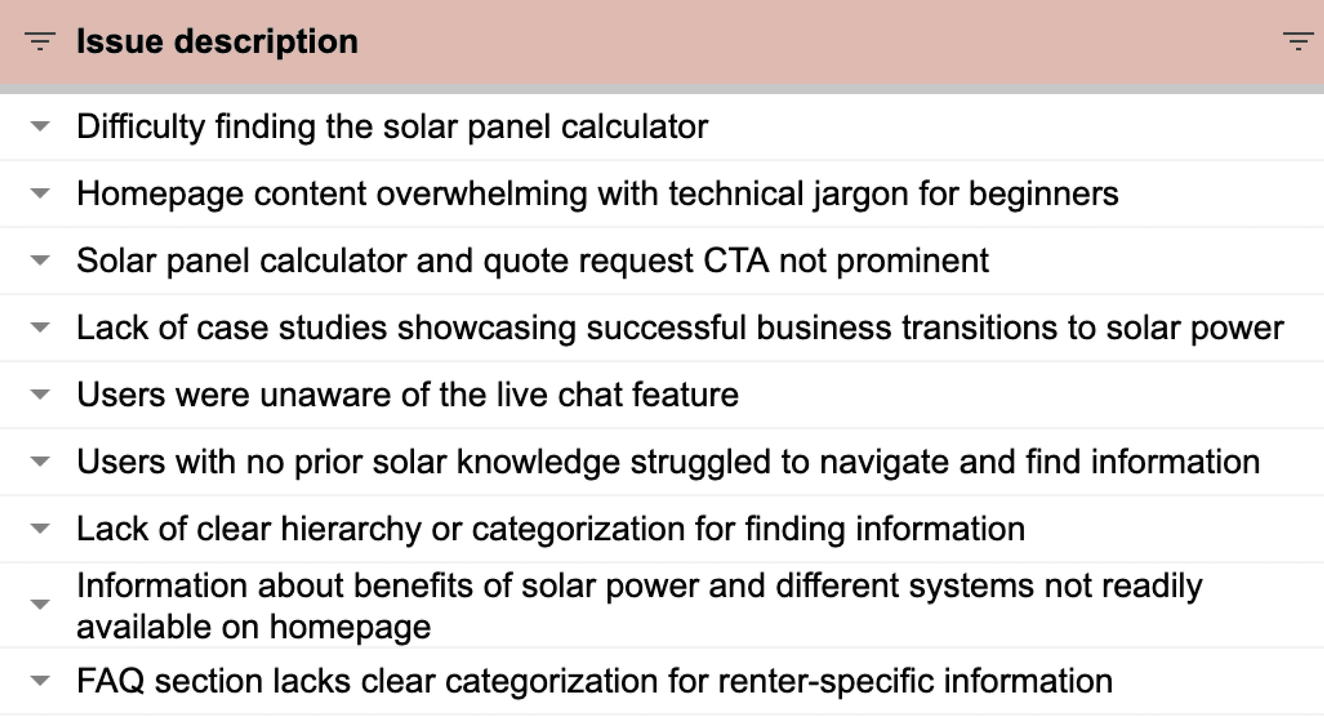
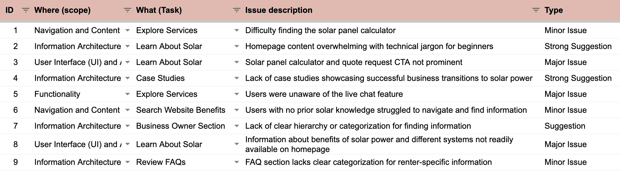
Difficulty finding the solar panel Calculator
Users with no prior solar knowledge struggled
to navigate and find information
FAQ Section lacks clear categorization for
renter-specific information
Difficulty finding the solar panel Calculator
Users with no prior solar knowledge struggled
to navigate and find information
FAQ Section lacks clear categorization for
renter-specific information
Difficulty finding the solar panel Calculator
Users with no prior solar knowledge struggled
to navigate and find information
FAQ Section lacks clear categorization for
renter-specific information
Solutions
Solutions
Refined the Experience
Refined the Experience
Refined the Experience
Calculator accessibility
Calculator accessibility
Before: No calculator on the site users couldn’t estimate costs or ROI,
causing confusion and drop-offs.
Before: No calculator on the site users couldn’t estimate costs or ROI, causing confusion and drop-offs.

After: Added a dedicated, easy-to-access calculator users can now
quickly see costs, savings, and lifespan, improving engagement.
After: Added a dedicated, easy-to-access calculator users can now quickly see costs, savings, and lifespan, improving engagement.

Dedicated beginner's section
Dedicated beginner's section
Before: The site only offered long YouTube videos and podcasts, requiring
users to leave the page many found them boring or too time-consuming.
Before: The site only offered long YouTube videos and podcasts, requiring users to leave the page many found them boring or too time-consuming.

After: I introduced a simple, on-site explainer section with clear language, visuals, and a quick benefits list designed for users with no technical background.
After: I introduced a simple, on-site explainer section with clear language, visuals, and a quick benefits list designed for users with no technical background.

Targeted content for renters
Targeted content for renters
Before: The FAQ section only addressed homeowners and business owners, leaving renters confused and underserved. User interviews revealed renters couldn’t find answers about solar benefits or installation in rental properties.
Before: The FAQ section only addressed homeowners and business owners, leaving renters confused and underserved. User interviews revealed renters couldn’t find answers about solar benefits or installation in rental properties.
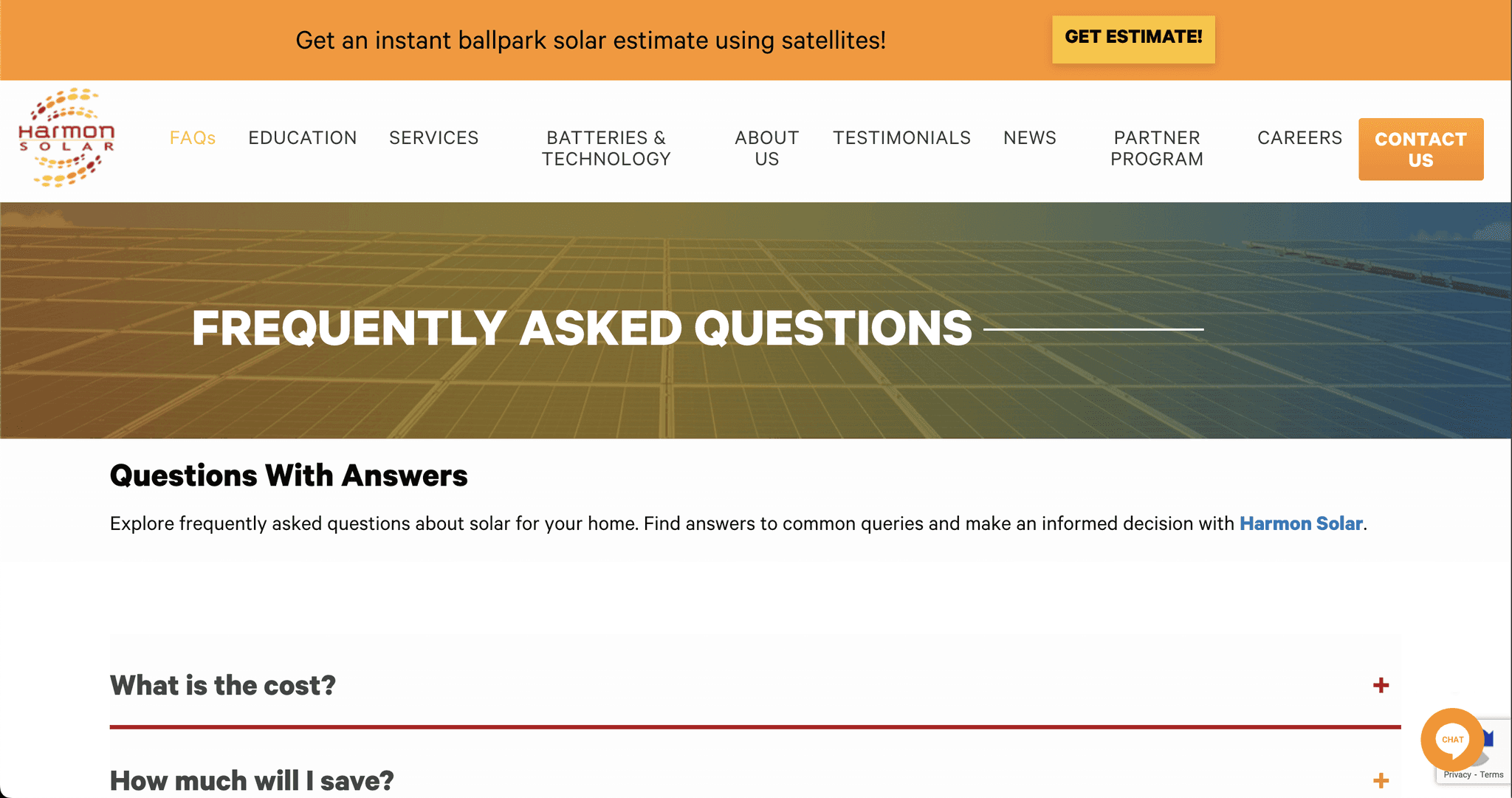
After: Redesigned the FAQ with clear categories, adding a dedicated section for renters with tailored questions about shared solar programs, leasing options, and renter-specific benefits—improving clarity and inclusivity.
After: Redesigned the FAQ with clear categories, adding a dedicated section for renters with tailored questions about shared solar programs, leasing options, and renter-specific benefits—improving clarity and inclusivity.


Live chat awareness: Increase awareness of the live chat feature by adding prominent icons on relevant pages.
Live chat awareness: Increase awareness of the live chat feature by adding prominent icons on relevant pages.
Live chat awareness: Increase awareness of the live chat feature by adding prominent icons on relevant pages.
Takeaways
Takeaways
Takeaways
Being the listener
Being the listener
Being the listener
Conducting remote interviews really put me on the spot, but I was able to find my footing. I did my best to let conversations free-flow so I could gain unique insights from each of my interviews. Often I would get similar opinions but frustrations that varied. Each interview provided me with new perspectives that I could incorporate into our brain-storming.
Conducting remote interviews really put me on the spot, but I was able to find my footing. I did my best to let conversations free-flow so I could gain unique insights from each of my interviews. Often I would get similar opinions but frustrations that varied. Each interview provided me with new perspectives that I could incorporate into our brain-storming.
Conclusion
Conclusion
Conclusion
Our usability Project revealed critical areas for improvement that significantly impact user experience across the Harmonsolar website.
Our usability Project revealed critical areas for improvement that significantly impact user experience across the Harmonsolar website.
By implementing the recommended changes, we anticipate enhanced user engagement and satisfaction, ensuring the website aligns with usability best practices.
By implementing the recommended changes, we anticipate enhanced user engagement and satisfaction, ensuring the website aligns with usability best practices.
Future efforts will focus on continuous improvement through regular usability testing and user feedback to adapt to evolving user needs and technology trends.
Future efforts will focus on continuous improvement through regular usability testing and user feedback to adapt to evolving user needs and technology trends.